This is initial exploration and appliction of Type Classification done during the unit one of my postgrad at University of the Arts London. I have always had a personal bias towards sans serif typeface because of it it’s simple, clean and minimal nature. Serif typefaces, or type where letters have ‘little feet’ feel more traditional and mature unlike sans serif which give a more modern look. Exploration of type during term one helped me understand different fonts and how they make me feel and how a single stroke can evoke a completely different meaning to a design.
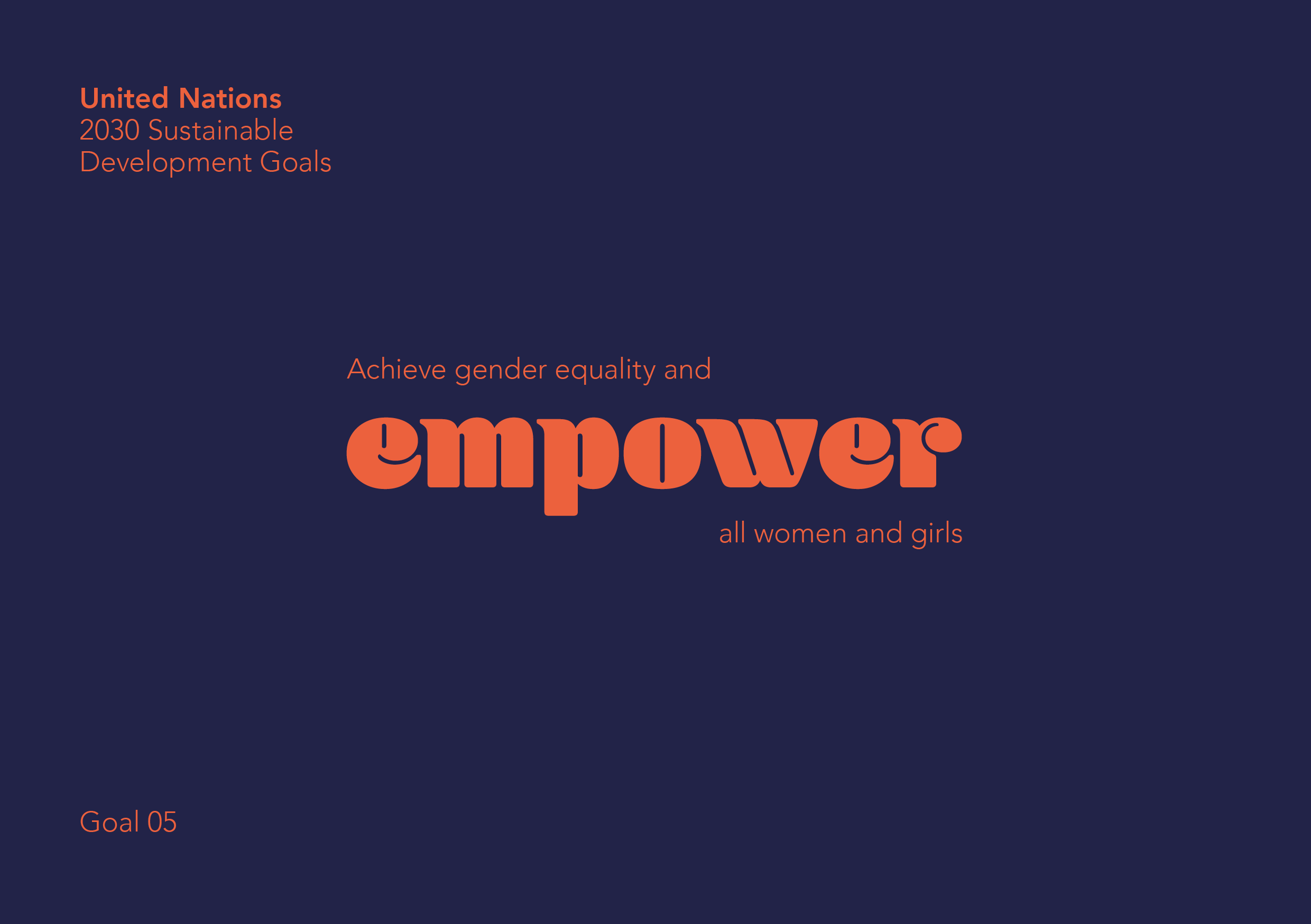
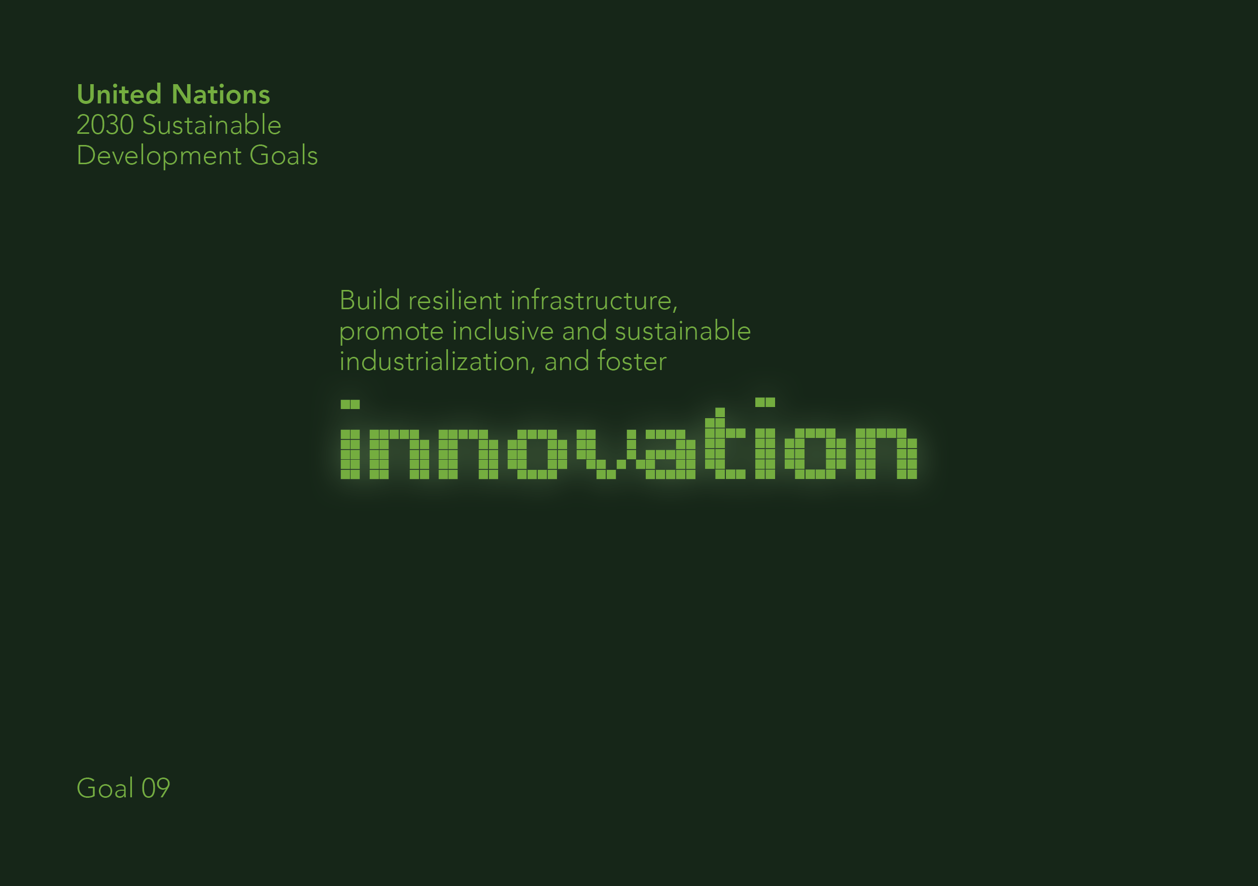
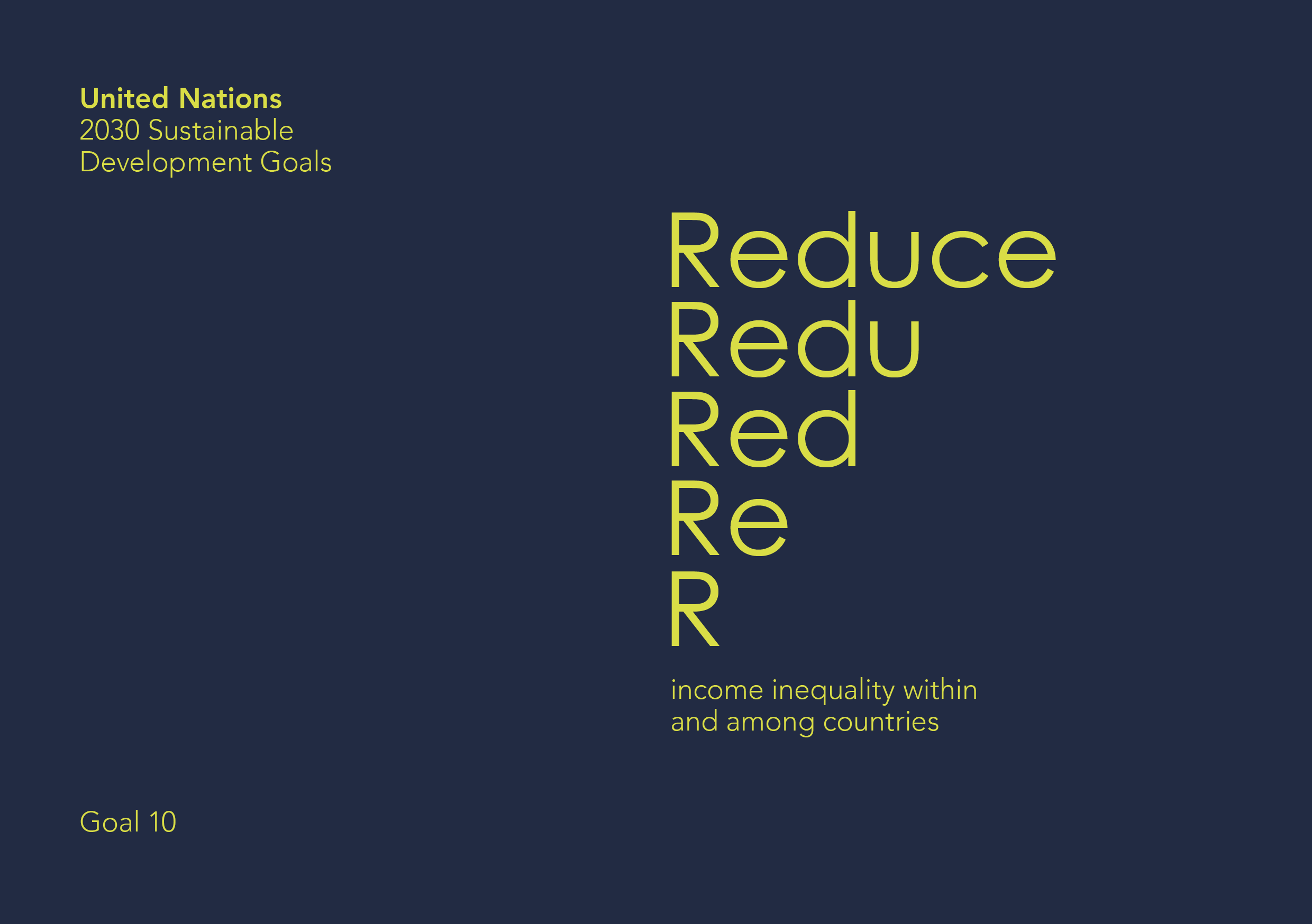
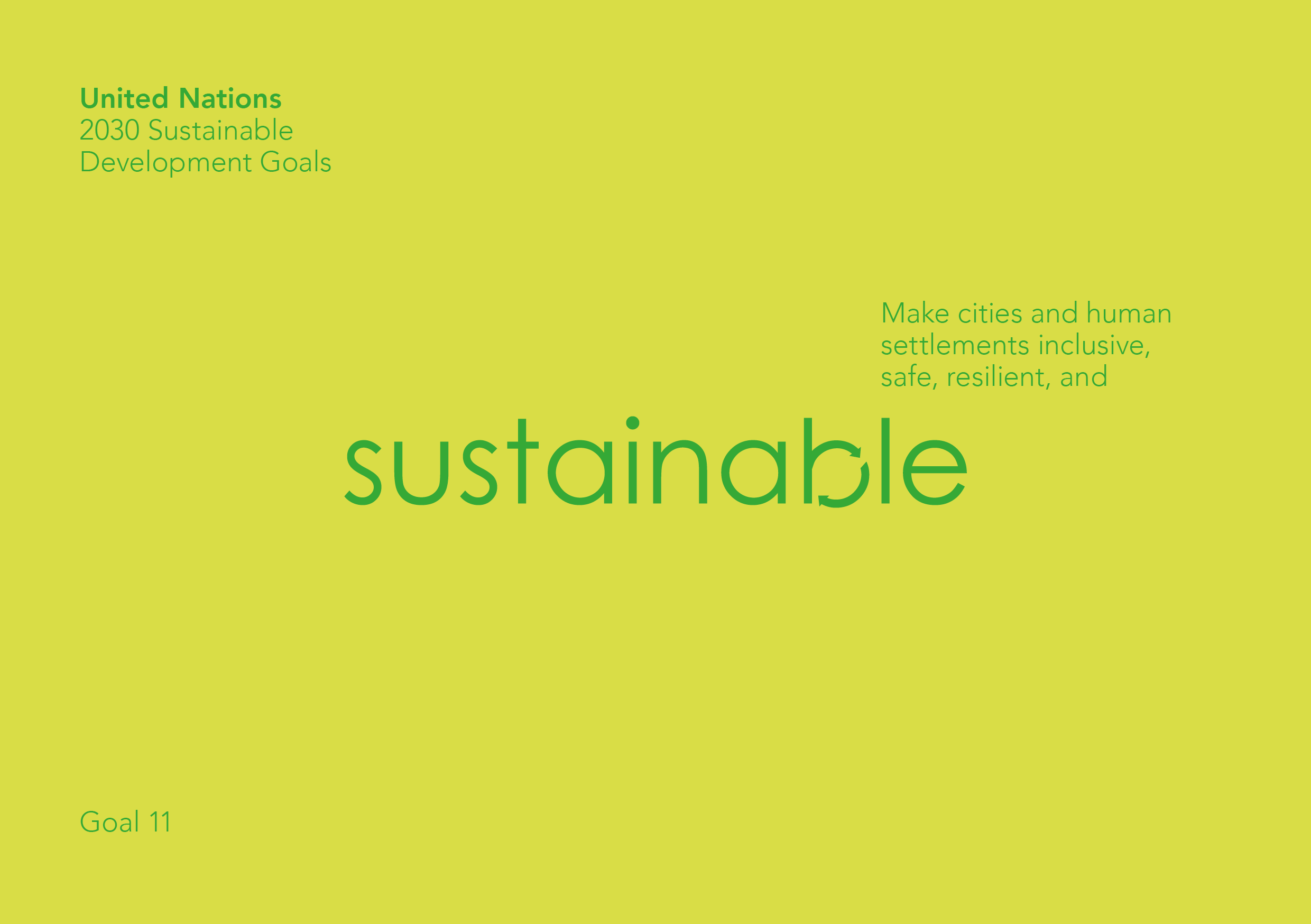
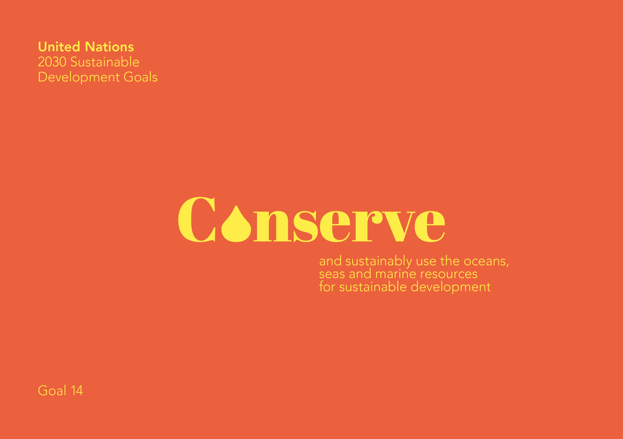
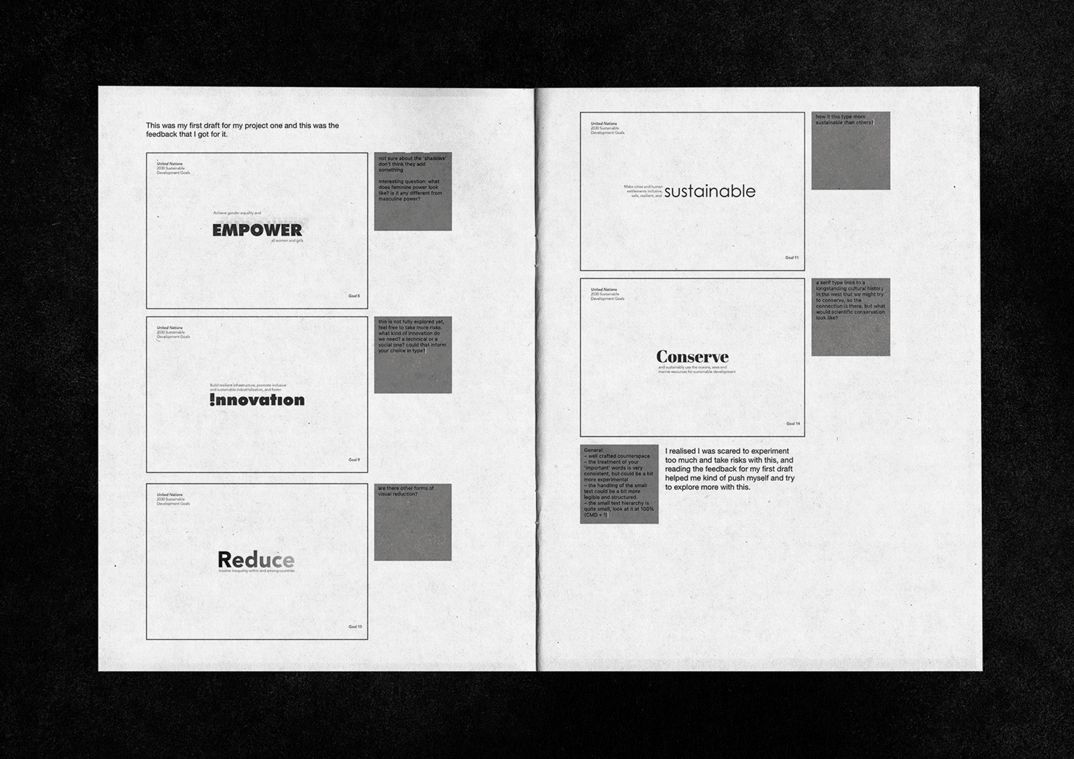
For this project we had to take goals from UN and highlight a word of emphasis and making sure the word looks like itself.
Working on this project gave me a whole new outlook to design and fonts. Playing with different typefaces to give a word a specific meaning was challenge in itself and adding colours to the mix made it more fun and interesting which I loved. One of my favourite learning moment while designing this project was findng the answer to the questions, “What do you think feminine empowerment looks like?”
“How do you want feminine empowerment to look like in an ideal world?”
Which I honestly never would’ve thought about before while deisigning. To answer this I focused on researching and studying the gestalt principle and about a thousand fonts.
softwares used
Adobe InDesign, Photoshop, Illustrator
Adobe InDesign, Photoshop, Illustrator
skills used
Visual Identity, Typography, Layout design, Color theory, Grid design
Visual Identity, Typography, Layout design, Color theory, Grid design
year created
2022
2022